Your logo does more work than almost anything else in your roofing business. It rides down the street on your trucks, sits at the top of every estimate, and shows up next to your name in Google search results. For most homeowners, it is the very first impression they form of your company, long before they ever talk to you.
The problem is that most roofing logos quietly work against the business they represent. After designing brands for dozens of roofing contractors, we see the same avoidable mistakes over and over. Here are the five biggest ones, and exactly how to fix each.
1. Using clip art everyone else already uses
Open Google Images, search "roof logo," and you will see the same handful of generic house-and-roof icons on thousands of contractor trucks across the country. When your logo looks like a template, homeowners assume your work is a template too.
The fix is a custom mark built around something specific to your company: your name, your region, or a distinctive shape that reads instantly at a distance. It does not need to be complicated. It needs to be yours.
2. Too much detail to survive a truck door
A logo that looks great at full size on a screen often turns into an unreadable smudge on a 40 foot boom truck or a one inch app icon. Fine lines disappear, thin text closes up, and detailed illustrations become mud.
Design for the smallest and the largest sizes first. A strong roofing logo works in a single color, holds up as a yard sign seen from the street, and stays crisp as a tiny profile photo on your Google Business Profile.
3. Colors that signal "cheap"
Color is emotional. Muddy tones, clashing brights, and low-contrast combinations make a company feel less trustworthy without the homeowner ever knowing why. In roofing, where you are asking someone to trust you with a five figure job on their most valuable asset, that matters.
Pick a tight palette, usually two colors plus a neutral, and use it consistently everywhere. Deep blues, charcoals, and strong reds tend to read as established and dependable in the trades.
4. A logo that only exists as one blurry file
We constantly meet roofers whose only copy of their logo is a low resolution image someone made years ago. They cannot put it on a shirt, a sign, or a printed estimate without it looking pixelated.
A real brand ships in vector format, which scales to any size without losing quality, plus single-color and reversed versions for embroidery, signage, and dark backgrounds. If you only have one JPG, you do not really own a logo, you own a picture of one.
5. No consistency across everything you touch
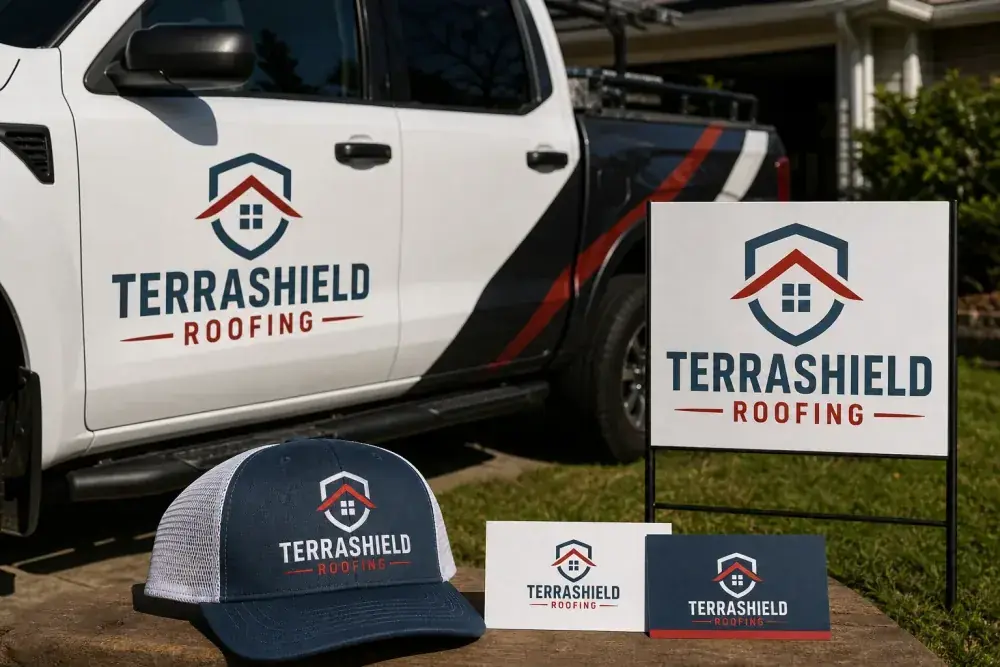
Even a great logo fails if the truck, the yard sign, the website, and the business card all look like they came from four different companies. Consistency is what turns a logo into a brand that people start to recognize and remember.
Lock down your logo, colors, and fonts once, then apply them everywhere. Over time, a homeowner who sees your sign in a neighbor's yard and later spots your truck at the store starts to feel like they already know you. That familiarity wins bids.
The bottom line
A professional logo will not fix bad workmanship, but a weak one will absolutely cost you jobs you should have won. When your brand looks as good as your roofs, you stop competing on price and start competing on trust.